Vellum and Watercolor Wedding Invitations
This couple’s wedding invitation design incorporated some of my favorite things: watercolor, vellum, modern details & classic type. The bride was a dream to work with. She created a hilarious power point for me of some of her (and her fiancé’s) favorite things. The entire wedding day was a balance of masculine and feminine – him & her.
The first time we sat down and reviewed sketches got me even more excited for what the finals would look like. We worked together to pulled out all the elements they did and did like to create something totally unique. We decided on using a watercolor background (for her) with gold foil geometric lines (for him).
Then, I set about the mixed type on the invite itself. We chose to leave her name in a script and his as a rigid serif. We combine the two in a small monogram at the top of the invitation. The type was all printed on frosted semi-transparent vellum which revealed a watercolor piece underneath. This piece also had gold foil detailing for some shine.
To avoid extra details, we printed a very simple business card which directed guests to their website where they could RSVP and find out more.
The final result was gorgeous. I know their guests received a beautiful piece of mail when they opened these.
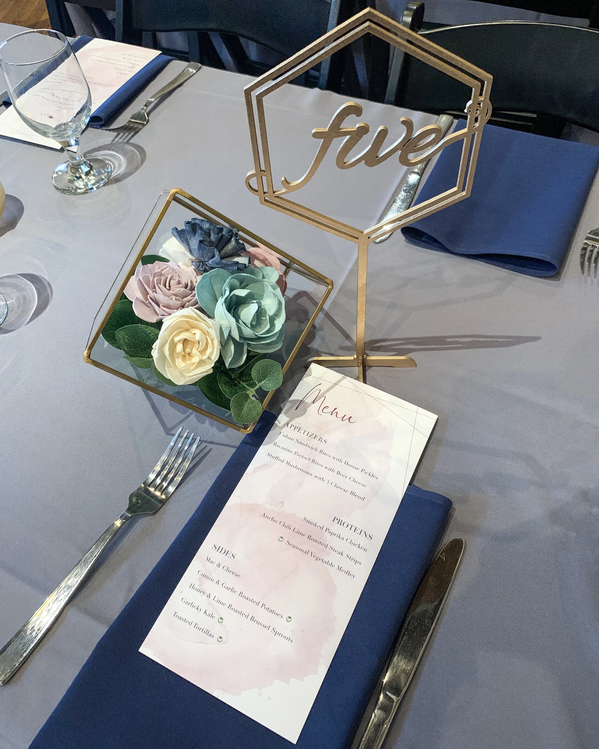
I also designed menus for them which tied in the geometric lines, type and color pallet of the wedding day. Here is a photo of the table layout and how the soft florals tied into the colors and the geometric lines played on the table numbers.
This suite was hands down my favorite to work on in 2019. It isn’t often you get to play with so many elements. I hope I get to do more like this in the future. So if you are getting married, reach out and let’s chat about invites & paper goods for your wedding.


